Showing posts with label Art. Show all posts

Tuesday, 26 March 2013

Be a Good Egg this Easter!

For the Lindt Big Egg Hunt in support of the charity Action for Children, a 101 giant Easter Eggs were hidden in cities throughout the UK,  and I found a couple in Covent Garden! I took pictures of my favourite ones and looked up the artists on the Big Egg Hunt website. You can bid on one of the artworks and support the charity on the website: http://www.thebigegghunt.co.uk/eggs

My Favourites

Hello Cheeky

Hattie Stewart is a London-based illustrator originally from Colchester, Essex. A self-professed 'professional doodler', her playful style extends itself through art and fashion, working with designers such as House Of Holland, Marc By Marc Jacobs and Adidas. Recently her notoriety has increased due to her project 'Doodle-Bombing', where she draws over the covers of influential fashion publications such as Vogue and i:D. Hattie has recently completed a new project doodling on 14 vintage Playboy magazines.This was approved by Playboy who shared the project on their facebook page. Her current work involves more high-end collaborations.

Dieter-Norbert

Chinese-German artist Peter Ibruegger is best known for his product design range of moustache mugs, sugar bowl hats and bow tie mugs which are being sold in exclusive boutiques in more than 30 countries. 

His extended practice is focused on drawings and deals with questions of identity and desire.

Smiley Stop

Jack Brindley is an emerging young artist living and working in London. Currently studying Painting at the Royal College of Art, Jack’s body of work spans painting, sculpture, photography and print. Interested in the construction of visual and verbal languages, his work explores how expression is generated in relation to its position in society and culture.

His group exhibitions in 2012 included ‘Bloomberg New Contemporaries’, ICA London and Liverpool, and ‘Dromology’, South Square Gallery, Bradford. In 2011 he was awarded a residency by the Architectural Foundation at the South Kilburn Studios

Untitled

Cassie Howard makes paintings that examine the interaction of people within society. She is interested in the role the artist has in directing the viewer.

Cassie’s subjects are people. The figures are sometimes paired with separate paintings of public objects such as park benches, sheds, and rows of trees. The people and objects are always presented within a white space devoid of any surrounding context. The viewers bring their own history to imagine what is missing
SS Eggterprise

Chris Martin spends much of his working day deleting emails from misguided Coldplay fans, but any remaining time is spent tongue to cheek and crayons in hand. Chris also has a vicarious fascination with notions of friendship and love, things he is yet to experience thanks to his unwavering dedication to his art.

His fledgling, yet already impressive career, has seen him work for many major clients, as well as somehow managing to pick up a D&AD Yellow Pencil along the way


Also cool

A Frugal Meal

Charlie Billingham studied Fine Art and History of Art in Edinburgh and then continued his studies in Fine Art at the Royal Academy Schools. His work involves painting and printmaking, as well as making installations which use these disciplines and combine them with objects. Much of his recent work has used sections of late eighteenth and early nineteenth-century etchings by James Gillray and George Cruikshank. Charlie’s work has been exhibited and collected both nationally and internationally.


Because this is the one I wanted to unwrap the most :)

Lindor

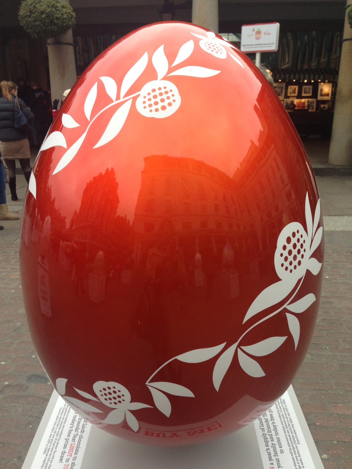
For more than 165 years, the Swiss Master Chocolatiers from Lindt have dedicated themselves to crafting the finest chocolate. Their dedication, passion and skill have led to the creation of the exquisite Gold Bunny and Lindor truffles, amongst many other delightful chocolate experiences. Lindt believes in the magic of families and is proud to join Action for Children in The Big Egg Hunt as Headline Sponsor. This egg is a creative representation of our irresistible Lindor truffle filled egg, the perfect blissful Easter treat - sampled throughout the events


All the content about the artists is from the Lindt Big Egg Hunt website, 
photos here are taken by me.

Friday, 22 February 2013

Lichtenstein - A Retrospective

Yesterday, Tate Modern opened its new exhibition 'Lichtenstein - A Retrospective' to the public. What I like about a retrospective like this one is that it introduces you to those lesser known works from the artist, some of which I find more interesting than the ones so often referred to. But that of course is personal taste, not to be discussed - like the French proverb says: "les goûts et les couleurs ne se discutent pas"

Lichtenstein, probably one of the most recognized artists of the American pop art movement, and a contemporary of Pollock and Rothko, broke with those artists' movement known as abstract expressionism to develop a new concept, one of painting inspired by comic strips, advertising and mass culture imagery.

When asked about Lichtenstein the works that often come to mind are his comic book paintings. But Lichtenstein wasn't a fan of comic books per se, he was rather intrigued by an underlying principle in art, namely what is the underlying force that makes a painting of a certain image more valuable than that same image in the comic book? He was intrigued by the nature of the cartoon, an image as far as possible from an artistic image and how it could be turned into a formal painting, a formal art work with only minor changes. 


Don't you like the painting on the left? :) It's titled: The ring (Engagement) and dates from 1962.

But as you might already have inferred from what I wrote at the beginning, my favourite paintings on show in this retrospective weren't the comic book ones - rather his take on Monet's Rouen Cathedral is what caught my eye. 


Monet wasn't the only artist Lichtenstein gave his own interpretation to. He also engaged with Picasso's, Matisse's and Mondrian's work for example, each time staying true to the stylistic convention of the movement but letting it emerge through his pop art filter.  

Another one of his series that I really liked were his Mirrors. Here the painting is not only a painting, it is also a sculpture as the form of the canvas has taken on the form of the object represented, and it is conveying its intricate characteristic, i.e. reflection, through a composition of well placed dots. But it is a mock object, a mirror showing no reflection at all of the object put before it.  


I would really recommend you this exhibition! It is very accessible art, very pleasing to the eye and actually just very fun!

Tate Modern has a great audio guide system which is really worth taking along! You hear stories about the art works, and commentary from the curators and even from Lichtenstein himself. And you also get access to his biography and additional material like e.g. his scrap books ( he never worked from real life objects, he always started working with 2D representations)

The exhibition runs until the 27th of May 2013! So plenty of time for you to get there and like me make new discoveries about this artist, like his fascination later in life with the simplicity of Chinese art!

For more information go to the Tate modern website


Monday, 4 February 2013

On Lightning Striking

The animated short film Paperman produced by Walt Disney Animation studios just makes my heart melt like a gooey chocolate lying in the warm summer sun.

It's Disney romance at its best: a setting so recognizable to many of us young professionals but infused with the perfect dose of Disney magic, no words necessary, just the characters' eyes and an amazing underscoring musical composition... that one first glance, love at first sight...do you remember that feeling? Have you ever felt it? - Swoon - I bet this ingenious love story will get many shares with Valentines nearing...maybe you could send it to that special someone who you never dared speak to...


The sudden feeling of lightning striking and the dreaming what-if feeling really remind me of one of my favorite poems by Charles Baudelaire (first the original in French, then a translation by William Aggeler)

À une passante
La rue assourdissante autour de moi hurlait.

Longue, mince, en grand deuil, douleur majestueuse,
Une femme passa, d'une main fastueuse
Soulevant, balançant le feston et l'ourlet;


Agile et noble, avec sa jambe de statue.

Moi, je buvais, crispé comme un extravagant,
Dans son oeil, ciel livide où germe l'ouragan,
La douceur qui fascine et le plaisir qui tue.


Un éclair... puis la nuit! — Fugitive beauté 

Dont le regard m'a fait soudainement renaître,
Ne te verrai-je plus que dans l'éternité?


Ailleurs, bien loin d'ici! trop tard! jamais peut-être!

Car j'ignore où tu fuis, tu ne sais où je vais,
Ô toi que j'eusse aimée, ô toi qui le savais!


— Charles Baudelaire

To a Passer-By
The street about me roared with a deafening sound. 

Tall, slender, in heavy mourning, majestic grief, 
A woman passed, with a glittering hand 
Raising, swinging the hem and flounces of her skirt;


Agile and graceful, her leg was like a statue's. 

Tense as in a delirium, I drank 
From her eyes, pale sky where tempests germinate, 
The sweetness that enthralls and the pleasure that kills.


A lightning flash... then night! Fleeting beauty 

By whose glance I was suddenly reborn, 
Will I see you no more before eternity?


Elsewhere, far, far from here! too late! never perhaps!

For I know not where you fled, you know not where I go,
O you whom I would have loved, O you who knew it!


— William Aggeler, The Flowers of Evil (Fresno, CA: Academy Library Guild, 1954)


I really hope that the short will win its received nomination for the Best Animated Short film at the 85th Academy Awards (the Oscars ;) ). Not only because the story is so endearing to all of us hopeless romantics out there, but also because the technology behind it merges the best of two worlds for the first time by bringing together the 'old-school' 2D drawing and CG technology (computer generated animation). 


Credits for Paperman:
Directed by John Kahrs
Produced by Kristina Reed and John Lasseter
Voices by John Kahrs and Kari Wahlgren
Music by Christophe Beck
Animation by Patrick Osborne (animation supervisor)


Wednesday, 30 January 2013

Lights! Let the show begin!

Today, the much anticipated new exhibition at the Hayward Gallery on London's South Bank opened: LIGHT SHOW. And what a show it was! Now that all Christmas decorations have disappeared from London's high streets and shops, an infuse of light was much needed to battle the darkness outside. 
 
This exhibition drives away gloominess. And if all that blinking, buzzing, and sparkling of the artworks does not put a twinkle in your eye, their ingenuity sure has to! Some of the pieces I saw were pure brilliance, both literally and figuratively. The manner in which these artists employ light to create illusions, atmosphere and perception is beyond compare! 

This exhibition is a must if you live in or are visiting London! It runs until the 28th of April!

Let me give you a sneak preview of what you can see. There are no videos or pictures that can do the artworks full justice, so if you can I would advise you to go experience the brilliance yourself!

The exhibition opens with Leo Villareal's Cylinder II (2012) of which its 19,600 white LED lights shine in ever-changing patterns and showers you with sparkle as of falling star dust. 


Jim Campbell's Exploded View (Commuters) really amazed me! "His 'exploded views' conflate elements of sculpture and cinema, stretching the moving image and the position of the viewer. Seen from most perspectives, the works appear as a random array of lights that blink on and off. But from a certain distance and angle, a discernible image emerges. In the case of Exploded View (Commuters) (2011), the impression of shadowy figures that dissolve and resolve as the viewer moves around is created by more than a 1000 LED bulbs. Each light flickers as a pixel, collectively they appear to coalesce as an image." from the LIGHT SHOW booklet. 


Carlos Cruz-Diez' Chromosaturation puts you as spectator in three monochrome situations. Fierce Blue, Red and Green lights act with all their force on the walls, objects and the viewers. "For the artist, colour does not consist of pigment on a solid surface, but it is a situation caused by the projection of light, and the way in which the light is perceived by the human eye. Colour becomes a situation happening in space" from the LIGHT SHOW booklet. 

Panoramic view of Carlos Cruz-Diez' 3 monochrome lighted rooms

Philippe Parreno's Marquee (2011) acting as an 'electric tiara' for Ann Veronica Janssen's Rose (2007)(don't you just love the word 'electric tiara by which they refer to the illuminated marque!!! :) )

Philippe Parreno's Marquee (2011)
Ann Veronica Janssen's Rose (2007)
Olafur Eliasson's Model for a timeless garden (2011) in which fountains are lit by stroboscopic lamps in an otherwise completely dark room, gives you the impression that your eyes are transformed into slow shutters. The flashing stroboscopic lamps create an effect of frozen images. Very cool! Because of the intermittent lighting, a panoramic picture produces the effect of a barcode :)

Panoramic view of Olafur Eliasson's Model for a timeless garden
Still of Olafur Eliasson's Model for a timeless garden

These were only a couple of the 25 art works you can go see, to
 find more information go to the Hayward Gallery's website


(all pictures and videos made by myself)

If you like the blog and want to be in the know on new articles, like the facebook page and you will get new article notifications on facebook! ;)

Friday, 25 January 2013

Juergen Teller: Woo at ICA in London

Last Wednesday, the 23rd of January 2013, the new exhibition Woo featuring photographer Juergen Teller's work opened at the Institute of Contemporary Arts (ICA) in London


Kate Moss by Juergen Teller
Teller's photography has penetrated both the art and the commercial world. You probably have come across his work in glossy magazines. He has been the photographer for the campaigns  of celine and marc jacobs. The last for which he has shot the iconic campaigns for at least the last 14 years.  
Celine Fall-Winter 2010-11
Celine Fall-Winter 2012-13
Teller's style is very distinctive, and you could label it very honest and fragile. His photos are almost always harshly lit and almost never retouched. So the images are not always the most flattering for the models in them, but this makes them more approachable and even more likeable, a tactic that is not often used in fashion photography. 

His distinctive sytle was developed in the early 90s in collaboration with stylist Venetia Scott - his then partner. The two of them spearheaded a movement that challenged the world's preconceptions of fashion photography throughout the 1990s. Their use of down-at-heel locations (often their own homes), idiosyncratic models and insistence upon creating a narrative that appeared to go beyond simply "showing the clothes", was in direct opposition to the status-driven aesthetic of the Eighties. Call it grunge, real-life photography or – most infamously – heroin chic. None of these labels are valid or do their work justice. More than any other of the school's main protagonists – David Sims, Corinne Day, Nigel Shafran among them – Teller turned this approach into an art form cfr. (1)


Elle Fanning for Marc by Marc Jacobs 2011
Sofia Coppola for Marc Jacobs Perfume

While the pictures may look spontaneous, they are far from it. For the Jacobs campaign Teller may work with a skeletal team – often just with his subject and without the elsewhere-requisite hair and make-up and aforementioned art director, creative director, CEO and so forth. He also has enough faith in his ability to produce an end result to create an environment in which a story is allowed, organically, to unfold. But there is always a story – generally a romantic story or "fairytale" as Teller describes it. These are rather more than mere snapshots, then, even though, on at least some occasions, their appeal lies in the fact that they may, at first glance and to the more naïve onlooker, look that way. At least part of the reason for this is that Teller is pretty much alone in the industry in that his work is only very rarely – if ever – retouched. cfr. (1)

In the end the calibre of the lead character each season – be she or he an actor, musician, artist, photographer, film-maker – is such that we could all be forgiven for wanting to be them. And that, in the end, is precisely the point. The casting of these images is certainly amongst the most significant things about them and, given the strict adherence to youth and beauty that fashion photography for the most part subscribes to, it is also ground-breaking. cfr. (1)

But the exhibition at the ICA is not only about his commercial work. It also showcases Teller's non-commercial photography where themes such as family, history, nationhood take center stage and this seems to mark a big divide between that and his fashion work. cfr (2) 'Irene im Wald' and 'Keys to the House' are Teller’s most recent bodies of work, revealing the photographer’s more personal world in his hometown in Germany and family home in Suffolk. cfr (3) Teller was inspired to photograph the woods where he grew up after turning his lens on the Suffolk landscape a few years ago, where he and his art-dealer wife, Sadie Coles, with his two children Lola and Ed, rent a country house. "I had been going back to Germany and photographing the environment that is close to my childhood but I could never photograph the forest for some reason. Somehow, these landscape pictures in Suffolk opened up the trees in Germany for me." cfr (4)


From 'Irene im Wald' by Juergen Teller
The exhibition at the ICA is free, and it is really a gem that you should go see as it brings together his two kinds of photography, one with more glamorous subjects than the other, but both equally real. 


Kate Moss by Juergen Teller
For this article I am referring to he many articles that have been written about the artist, here are the links to the most entertaining ones:
There is also a link to a video reportage on the artist

(1) Article in the Independent of 30th of June 2009, 

Juergen Teller: Fashion's provocative photographer reveals all

(2) Article in the Guardian of 6th of January 2013

Juergen Teller: fame laid bare

(3) Exhibition Review on ICA website

Juergen Teller Woo

(4) Article in the Independent of 12th of January 2013

Monday, 14 January 2013

Bunnies

I came across this video ‘Chocolate Bunny’ by Dutch artists Lernert & Sander and I just had to share it with you!


Still from the Chocolate Bunny video by Lernert and Sander


I really like the use of one soft and sweet pastel colour for all décor elements as it enhances the contrast with the poor brown melting bunny. I also love the music by Nathan Larson underscoring the whole melting process, it makes the scenes that extra haunting and for some reason gives it a bit of humorous twist because it underlines the absurdity of the whole. What do you think of it?

They not only make videos and commercials, but also create installations - always with a humorous twist. If you were already living in London in 2010, you might remember the sculptural installations they created for the Selfdridges window displays drawing attention to the launch of the new Selfridges Shoe Galleries. Mundane household appliances were given a glamorous make-over!

Dustbuster Stilettos
Iron Stilettos
The video of these chocolate bunnies melting also reminded me of the dark humour cartoons that I really liked when I was studying for exams at university. I used to have a copy of The Book of Bunny Suicides by Andy Riley next to me for giggles when I needed a break from the dry formulas in the study books.


Still of the Lernert and Sander "Chocolate Bunny" video and the
photos of the artists'Selfridges installations by Lex Kembery taken from Lernert and Sander's website
Cartoons of Bunny Suicides from Andy Riley's website


Friday, 11 January 2013

Cloud Imagination (2)

A while back in my first Cloud Imagination article, I wrote about clouds and how they can spark your imaginiation through the forms that it can take. I mentioned two creative "Cloud" pieces - the "Cloud - Made of More" advertisement for Guinness by AMV BBDO UK  and the photographs by Christopher Jonassen

Now I would like to add another artist to this "Cloud" repertoire! Dutch artist Berndnaut Smilde invites clouds into indoor spaces and takes their picture before they mysteriously vanish. You can go see his work at the Ronchini Gallery in London where he is featured in the exhibition The Uncanny: Adeline de Monseignat and Berndnaut Smilde that opens to the public on the 16th of January.

Berndnaut Smilde's Nimbus II
‘Dutch artist, Berndnaut Smilde produces striking images of ‘real’ Nimbus clouds suspended within empty rooms. Using a fog machine, he carefully adjusts the temperature and humidity to produce clouds just long enough to be photographed. There is a unique ephemeral aspect to the work where the photograph captures a very brief moment before the cloud dissipates and disappears again as mysteriously as it was formed. His choice of lighting and viewing aspect enables him to create a representation of the cloud’s physicality. Smilde’s work looks at transience and challenges the physicality of space.’ –text from the website of the Ronchini Gallery


The following video show's the artist at work (the video is in Dutch)
  
Go see:
Exhibition Dates: 16 January – 16 February 2013
Opening Hours: Monday – Friday 10am–6pm, Saturday 10am – 5pm Location: 22 Dering Street, London, W1S 1AN

Wednesday, 9 January 2013

George The Poet

Yesterday evening, after a long day and another channel train trip, I came home to London and turned on the tv to wind down. Not really watching and more focused on the relay of the day with my fiancé, the warmth and rhythm of a man’s voice (but not my fiance’s this time) caught my attention. I heard a poem rhythmically spoken and saw simple but beautifully shot and chosen images and a great visual highlight at the end! Thank goodness for digital tv where you can rewind instantly and as often as you want. I watched this short film three times over!

This short film ‘Impossible’ is the result of collaboration between George The Poet who wrote and performed ‘Impossible’, Robert Ryan who directed and edited the film, Jeremy Hewson who was responsible for photography, Tom Rafferty who did graphics and Naughty Boy who managed sound production.
‘Impossible’ was George The Poet’s  third poem featured on Channel 4’s Random Acts. He is an up and coming act from North-West London and only twenty-one years old. Through his poems he offers politically conscious and often humorous social commentary. He draws from his life in London's inner-city as well as the Politics, Psychology and Sociology course he studies at Cambridge University. You can follow him through his blog or on twitter.

Random Acts is a short-form daily arts strand on Channel 4. Short films are chosen for their bold and creative expressions of creativity. Random Acts features both established artists and emerging talent and allows them to create their own pieces, unmediated by presenters and unfettered by the conventions of conservative arts television. Content includes, but is not restricted to, spoken word, dance, animation, video art and music. Visit http://randomacts.channel4.com/#home to see more short films.

George The Poet’s other Random Acts all of which – like ‘Impossible’- were produced by Duece Films and include 'My City' and 'Passion Fruit':
‘My City’
'My City' highlights a part of London that is often forgotten; the gap between the rich and poor, street crime, the rich melting pot of cultures, rundown urban spaces and how expensive it is to really enjoy our capital... at least while the city celebrates the world's largest sporting event.

 
Against the backdrop of Europe's largest carnival, George the Poet celebrates the vibrancy and creativity that emanates from London.
 
(I would want to share it with you the short film ‘Impossible’ but am guessing that copyright law doesn’t really allow me to do so legally, so you will have to wait until it comes onto Channel 4’s website)